Dezy


After conducting my research, I identified the key challenges users face during the booking process. To break them down effectively, I formulated clear problem statements, each linked to a specific user need. I then developed corresponding “How Might We” statements to explore potential solutions for each challenge. To track the success of these solutions, I also defined relevant KPIs.


Goals
Simplify the booking flow to reduce drop-offs and increase completed appointments.
Help users with zero dental knowledge identify their issues and book the right treatment confidently.
Enhance transparency in pricing, process and reviews to build trust and reduce hesitation.
Minimise last-minute cancellations and no-shows to optimise dentists’ schedules.
Improve communication between users and dentists by providing clear pre-appointment information.
Collect essential information about users’ dental issues to help dentists prepare for consultations and provide personalised care.
Success Metrics
Conversion Rates: Increase the percentage of users who complete the booking process.
Lead Quality: Boost the percentage of users who show up for their appointments and require the booked treatment.
Reduced Cancellations: Lower the rate of last-minute cancellations and no-shows.
User Satisfaction Score: Improve user ratings related to the ease and clarity of the booking experience.
Dentist Satisfaction Score: Enhance dentists’ feedback on the quality of booked appointments and patient preparedness.
Operational Cost Saving: Reduce customer support inquiries related to booking confusion and appointment changes.

Dividing the flow in three main phases - Treatment Selection, Assessment, and Book and confirm - creates a logical progression.
Breaking down the Assessment phase into questions and photos adds value for both users and dentists.
Adding intentional friction to filter non-serious users is a strategy to improve lead quality.
Meet Ananya
I find it essential to define my primary users, as it helps me understand their main goals and concerns. This approach ensures that my designs address the root of their problems, rather than focusing on superficial needs or nice-to-haves.
Ananya came to life from background research and my user interviews. She served as a reference point throughout the rest of the project, ensuring the user remained at the forefront of my design process.

User Journey and Features
How can we improve Ananya's Journey?

So what features are needed?
After mapping out Ananya’s journey and identifying how Dezy can enhance her experience when booking a dental consultation online, I outlined a list of key product features and requirements needed to achieve the desired 'To Be' state.

After aligning with business goals to improve the quality of leads and gathering data on the appointment booking process from users, we synthesised these information to develop an improved process within the existing booking flow framework.
I began with rough sketches and progressed to detailed wireframes. Multiple iterations of the flow were created and reviewed by team members, incorporating their feedback to refine and enhance the process further


In Iteration I, we streamlined the core structure of the booking flow, outlining all the essential steps required to book a dental consultation online. The goal was to simplify the process while ensuring users could easily navigate each step, from selecting their dental issue to confirming their appointment. This iteration served as the foundation for further improvements, focusing on enhancing clarity and reducing friction in the user journey.
My goal was to evaluate the process early and refine it throughout development. I recruited eight participants from my professional network, none of whom had prior experience with Dezy. The objective was to assess whether users could independently select the appropriate treatment and complete the entire booking flow without assistance. To ensure participants focused on the flow’s functionality rather than the brand, the prototype was presented in a simplified, low-fidelity format.
Testing Goals for Iteration I
Goal 1: Test overall functionality of the booking flow and ease of use.
Goal 2: Identify any obstacles users face while selecting treatments and completing the booking process.
Goal 3: Gather user feedback on desired improvements or additional features within the flow.
Goal 4: Assess whether the new flow enhances the platform’s usability and clarity, especially for users with limited dental awareness.
Goal 5: Determine if the categorisation helps user's find the right treatment easily


Iteration I remained somewhat vague and lacked a solution for users who were unsure about which treatment to choose or had zero to no dental awareness.
Users found answering questions to be an obstacle, as it added an extra step to the process. For users who were unsure about their dental issues, providing accurate answers felt challenging. However, collecting this information was essential to help dentists understand users’ concerns in advance, improving the consultation experience. Since removing the questions wasn’t an option, we needed to find a way to keep users motivated to share their information.
So how do we help users with zero dental awareness select the right treatment?
And how do we make it easier for the users to share their information?
To assist these users, we first needed to understand the challenges they faced. To gather sufficient information about their issues, we designed a separate flow with dynamic questioning. This approach allows users to select from predefined options, making it easier for them to respond. The questions adapt based on their answers, enabling us to explore their concerns in greater detail through multiple follow-up questions.
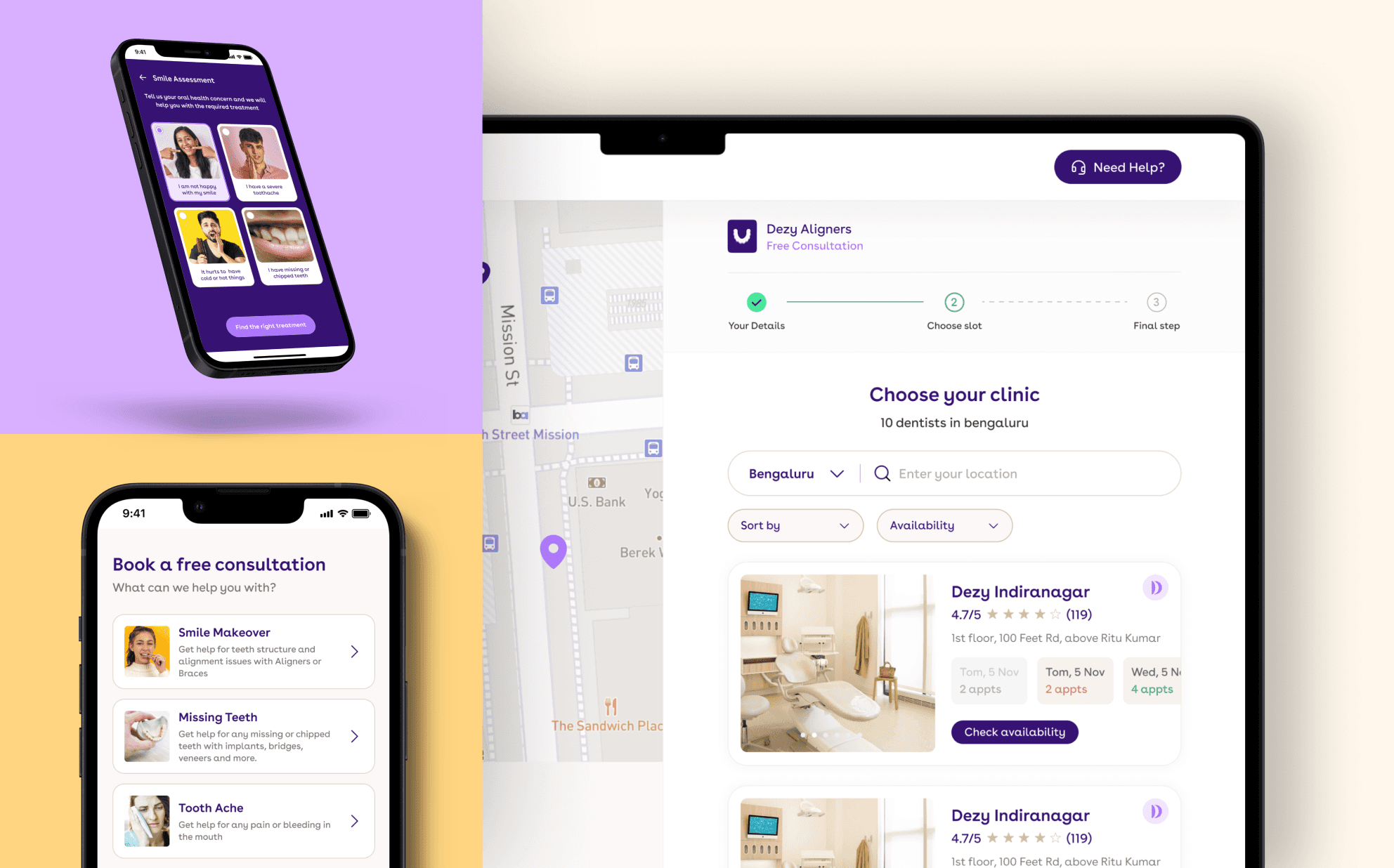
Smile Assessment
Our tech team developed an AI detection tool that can identify dental issues by analyzing images of a user’s teeth and mouth. The tool then generates a detailed report outlining the detected issues. We decided to integrate this tool into our booking flow to assist users with limited dental awareness. By uploading images of their teeth and answering a few quick questions, users receive personalised treatment recommendations based on the AI’s analysis, helping them confidently select the right treatment.
We also leveraged this tool to generate a free dental report for any user who submits their pictures. This free report serves as an incentive, motivating users to submit their pictures to assess their dental health and gain insights into potential issues.

We enhanced the flow chart by introducing an additional Smile Assessment Flow specifically designed for confused users. This flow allows users to take an assessment where they can share their dental information to receive a suggested treatment. After receiving the recommendation, they can proceed to book an appointment for the selected treatment.
The revised wireframes now include an additional flow for users who are unsure about which treatment they need, guiding them to the right option based on the data they provide. This ensures that every user can find the appropriate treatment.
To further improve the quality of leads, we've added a 'Submit Pictures' step (skippable), which provides dentists with detailed information about the user's dental issue, helping them offer more accurate consultations later. Users who complete this step and go through the entire process are more likely to be genuinely interested in treatment, effectively filtering out non-serious users early and reducing operational costs for the company.

Explore the Iteration II of booking flow with improved Categories, Smile Assessment feature, better lead qualification and a streamlined user journey. Click on View Prototype Button above.
The primary goal of testing Iteration II was to evaluate whether confused users opted for the Smile Assessment and if the updated treatment categories were easier to select. We also aimed to determine if the “Skip” option for submitting pictures helped reduce friction in the booking flow. Additionally, we gathered user feedback on potential improvements for this version.

Testing revealed that users found the emergency category booking process too lengthy, as they had to follow the same flow despite needing immediate attention. Users also requested more reviews and testimonials to build trust.
From a business perspective:
The marketing team suggested moving data capture to the start of the flow to retain user information, even if they dropped off mid-flow. This would allow follow-ups via calls or texts to encourage them to use our services.
The business team noted that users arriving via ads with a specific treatment in mind still had to go through the treatment selection process, risking drop-offs. To address this, they proposed creating a dedicated flow that allows these high-intent users to directly choose their consultation location.
To provide immediate care for emergency issues
Requiring users to complete a full booking process when they need immediate attention, such as for a severe toothache, can result in a poor experience. To better serve these users, we need to provide value and attention in just a few steps.
To streamline the experience, we developed a new flow tailored for urgent cases that require immediate action. We leveraged Dezy's 'Call a Dentist' service to add it as a feature for emergency cases, allowing users to quickly reach a dentist for immediate advice and relief until they can either visit our clinic or have a dentist reach them. We called it "Connect with Dentist" feature.

Quicker booking process for users from specific ads
To enhance the experience for users arriving from our paid treatment ads, we need to create a more efficient booking process. Since these users already show intent by clicking "Book an Appointment", the treatment selection step can be bypassed entirely.
Given that most of these users will not be logged in when they land on our website, the flow should begin with a prompt to enter their contact details and city, followed immediately by the option to select their preferred treatment location.
To further encourage these users to book an appointment, we should include prominent trust markers, such as testimonials, certifications, or success stories, that build credibility and confidence in Dezy's services.


Explore the Final UI of booking flow with added "Connect with Dentist" feature, Smile Assessment Flow and detailed treatment info. Click on View Prototype Button above.
Dezy has a clear vision of simplifying dental care through technology, and the improved booking flow is a step toward that goal. The next phase from a UX perspective involves monitoring how users interact with the new flow. Are confused users opting for the Smile Assessment? Does the streamlined treatment selection reduce drop-offs? Is the ‘Submit Pictures’ step motivating users to provide more information? Continuous feedback will help identify what works well, what needs refinement, and how evolving user needs can be addressed.
A key takeaway from this project is that design is an ongoing process. With a solid foundation in place, the focus now shifts to optimising the flow based on real-world usage and ensuring both users and dentists benefit from a seamless experience.
Learning 1: Understanding the User is key
Designing the new booking flow required a deep understanding of users’ needs, especially those with little to no dental knowledge. The Smile Assessment was developed to guide these users toward the right treatment, removing guesswork and boosting their confidence.
Balancing user convenience with the need to collect information for dentists was crucial. By offering a skippable ‘Submit Pictures’ step and providing a free dental report, we found a way to motivate users while reducing friction. This experience reinforced the importance of empathy in design, helping users feel supported while ensuring the business receives the data it needs.
Learning 2: Balancing Stakeholder Needs
One of the main challenges during this project was aligning the needs of different stakeholders. The marketing team wanted to capture user data early to follow up with potential leads, while the business team sought to streamline the flow for high-intent users arriving from specific treatment pages. At the same time, the design had to ensure users didn’t feel pressured or overwhelmed. This project taught me how to navigate competing priorities, gather input from various teams, and find solutions that balance business objectives with a positive user experience.