Web & mobile website

Redesigning website for a dental care brand

Team

Me (Product Designer), Amitto (Product Manager), Ankit (Product Manager), Harsh (Product Designer-LO), Sumit (Product Designer)

Timeline

Jul-Oct 2023 (4 months)

Tools

Figma, Miro, Adobe XD, Adobe CC, iPad, Photoshop, Maze

My Role

UX Research, Developed User Journeys, Wireframes and Prototypes. Collaborated with another designer on the UI features. Worked alongside Project Managers and Frontend Developers

Background

Originally founded in 2020 as Smiles.ai and rebranded as Dezy in 2023, Dezy is an O2O (Online to Offline) dental care provider that offers all dentistry services. The company emphasizes its core principles of working with vetted doctors, ensuring transparent communication, and providing anxiety-free consultations to enhance the user experience.

With the rebranding, Dezy needed a website redesign that aligned with its new brand positioning and principles. Dezy aims to establish itself as a premier, specialised brand within the dental care ecosystem.

This case study explores the process of redesigning the website to embody Dezy’s new brand values and guidelines, while enhancing clarity and credibility for its users.

Context

Following the rebranding from Smiles.ai to Dezy, all platforms required a transformation to reflect the new brand positioning and guidelines. User surveys highlighted that the current website lacked clarity, credibility and incomplete information, leading to user confusion. Additionally, the information hierarchy was disorganized, further impacting the user experience.

Dezy aims to address these issues by building a new, updated website that aligns with the brand's vision. The focus will be on establishing a clear, trustworthy presence while creating a more intuitive information structure to enhance user engagement and satisfaction.

Problem Statement

The current website does not align with Dezy’s updated brand purpose and fails to engage or inform users. It lacks easy access to important dental health information, services, and resources, leading to a high user drop-off rate of up to 82% across website.

The current website does not align with Dezy’s updated brand purpose and fails to engage or inform users. It lacks easy access to important dental health information, services, and resources, leading to a high user drop-off rate of up to 82% across website.

Breaking it down

To gain a deeper understanding of the issues, we broke down the problem statement into more specific components.

Decision Overload

Decision Overload

Decision Overload

Users encounter too many choices right away, with multiple scattered decision points causing frustration and confusion.


Confusing Content Hierarchy

Confusing Content Hierarchy

Confusing Content Hierarchy

The disorganized structure makes it hard for users to find relevant information, leading to excessive scrolling without reaching informed decisions.


Difficult Navigation

Difficult Navigation

Difficult Navigation

Poor navigation across pages adds to the confusion, making it challenging for users to explore the website smoothly and efficiently.

Insufficient Trust Signals

Insufficient Trust Signals

Insufficient Trust Signals

The website lacks trust markers such as patient testimonials, certifications, or clear information about the expertise of the dental professionals, making users hesitant to proceed further.


Outdated or Inconsistent Visual Design

Outdated or Inconsistent Visual Design

Outdated or Inconsistent Visual Design

The visual design does not reflect Dezy’s new brand identity, causing a disconnect between the brand’s message and the user’s perception, potentially eroding trust and credibility.

A screenshot from the audit of existing website

A screenshot from the audit of existing website

A screenshot from the audit of existing website

The Approach

The rebranding called for a complete website redesign to align with Dezy's updated brand vision while addressing the key issues users faced. Our goal was to simplify decision-making and create a more intuitive, engaging user journey.

We began by conducting thorough research on how users interact with dental and healthcare platforms and analyzing how our competitors are tackling similar challenges. A comprehensive website audit, combined with user interviews, surveys, and ethnographic field studies, provided deep insights into user behavior on the existing site, the difficulties they encountered, and their unmet needs.

By gathering extensive data upfront, we ensured that our design decisions were rooted in real user feedback and behavior, setting a strong foundation for a redesign that truly resonates with our users.

Understanding new brand purpose and strengths

To grasp Dezy's new brand positioning and purpose, we initiated the process by gathering insights from stakeholders. This involved defining brand principles, identifying the target audience, outlining business priorities, evaluating the company and product strengths, and segmenting the dental market.

To grasp Dezy's new brand positioning and purpose, we initiated the process by gathering insights from stakeholders. This involved defining brand principles, identifying the target audience, outlining business priorities, evaluating the company and product strengths, and segmenting the dental market.

Competitive Analysis

To better understand Dezy’s competitive landscape, we conducted a competitive analysis. Although we couldn’t find direct competitors offering the full range of dental treatments like Dezy, many competitors focus on specific treatments. To gain valuable insights, we expanded our analysis to include broader healthcare platforms. This approach helped us learn how these platforms address key issues related to credibility, clarity, awareness, and approachability, offering useful strategies that could be adapted for Dezy.

To better understand Dezy’s competitive landscape, we conducted a competitive analysis. Although we couldn’t find direct competitors offering the full range of dental treatments like Dezy, many competitors focus on specific treatments. To gain valuable insights, we expanded our analysis to include broader healthcare platforms. This approach helped us learn how these platforms address key issues related to credibility, clarity, awareness, and approachability, offering useful strategies that could be adapted for Dezy.

Secondary Research

User Interviews

To gain insights into the issues users were experiencing with the current website, we conducted user interviews with Dezy’s customers. These interviews involved asking open-ended questions to gain detailed insights into their experiences and their genuine needs. Through Zoom interviews, we engaged with 24 past customers, spending approximately 15-20 minutes with each participant.

We conducted user surveys and observed a few users interacting with the website to understand their decision-making processes and how they navigated through different sections. This helped us identify patterns in user behavior, uncover potential roadblocks, and gather valuable insights into how the website could be improved for a smoother and more intuitive experience.

Key Observations

Convenience

Convenience

Convenience

Users are open to booking dental services online as it saves time and fits well into their busy schedules.

Referrals Matter

Referrals Matter

Referrals Matter

Many people prefer visiting dental clinics or dentists that have been recommended to them, highlighting the importance of referrals.

Awareness Gap

Awareness Gap

Awareness Gap

Over 50% of the dental services offered are not well-known to users, revealing a significant gap in information.

Need for Clear Information

Need for Clear Information

Need for Clear Information

Users want more detailed information about the dental treatment process, suggesting a need for clearer, more comprehensive explanations of the procedures available.

Decision Overload

Decision Overload

Decision Overload

Users look for trust signals such as reviews, certifications, and dentist credentials before booking a service, indicating the importance of building trust and credibility on the platform.

User Needs

Comprehensive Information

Comprehensive Information

Comprehensive Information

Users seek detailed insights into dental treatments due to the intimidating nature of these procedures.

Dentist Profiles

Dentist Profiles

Dentist Profiles

Users are interested in learning more about the dentists performing their treatments, including their qualifications and experience, to establish trust and confidence.

Client Feedback and Evaluations

Client Feedback and Evaluations

Client Feedback and Evaluations

Users value access to authentic feedback from previous patients, such as testimonials and reviews, to gauge the quality of care and overall experience.

Easy Access to Consultations

Easy Access to Consultations

Easy Access to Consultations

Users need the ability to easily consult with a dentist both before and after treatment, ensuring they feel supported and well-informed throughout their dental journey.

Simplified Booking Process

Simplified Booking Process

Simplified Booking Process

Users expect a quick and easy appointment scheduling process, minimizing steps and reducing friction to enhance their experience.

User Personas

To better understand and address the needs of Dezy’s users, I created two personas: Anjali and Sumit. These personas serve as representative archetypes, capturing the key characteristics, behaviors, and needs identified through our research.

— Anjali represents a user who is new to dental treatments and seeks comprehensive information and reassurance.

— Sumit embodies a user who is familiar with dental care but values convenience, transparency, and personalized service.

By exploring the motivations and pain points of these personas, we can design more user-centric experiences that cater to the needs of a larger group of Dezy’s users.

How Might We

Creating Point of View (POV) statements based on research insights provided a clearer understanding of the specific challenges faced by users. These POV statements were then used to generate “How Might We” (HMW) questions, which served as a springboard for ideation and brainstorming potential solutions.

The “How Might We” questions helped us focus on reframing user problems into actionable design challenges. This process guided us toward developing solutions that directly address user needs.

Sitemap Creation

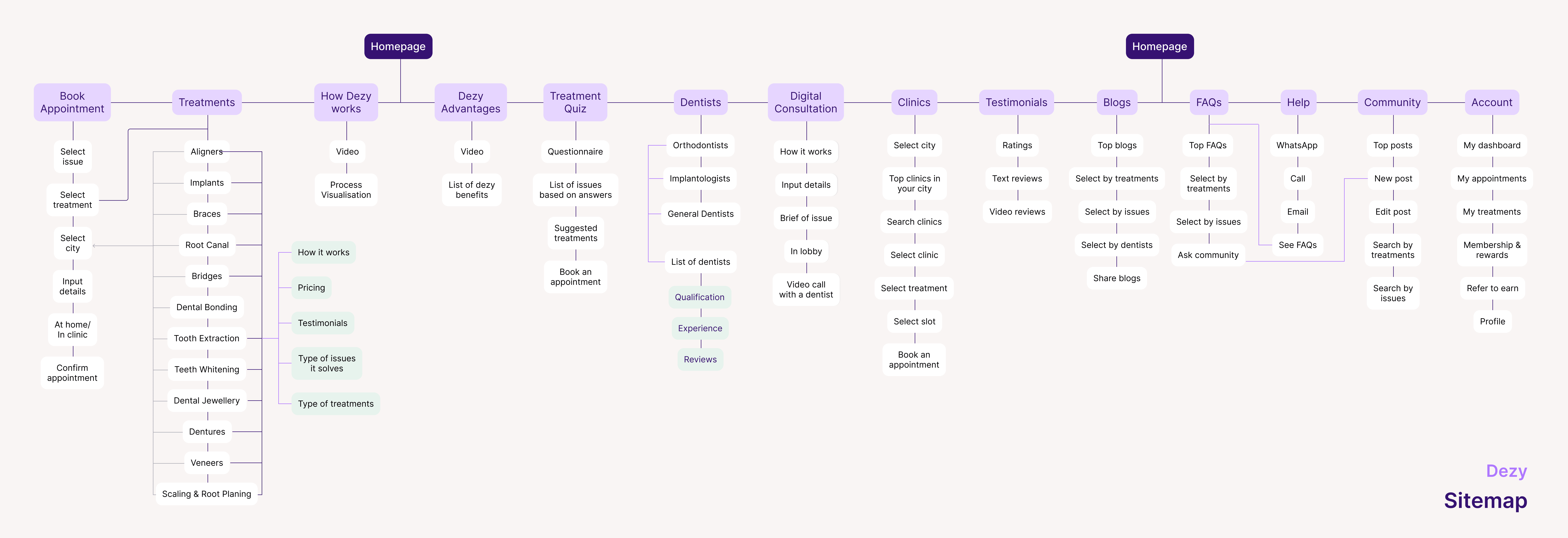
To provide a clear and effective hierarchical structure for the website, we developed a sitemap that outlines the organization and navigation of the site’s pages. This sitemap serves as a visual guide for how users will interact with the website, ensuring that essential information is easily accessible and logically arranged.

To provide a clear and effective hierarchical structure for the website, we developed a sitemap that outlines the organization and navigation of the site’s pages. This sitemap serves as a visual guide for how users will interact with the website, ensuring that essential information is easily accessible and logically arranged.

By establishing a well-organized sitemap, we ensure that users can easily navigate through the website, find relevant information, and complete their desired actions with minimal friction. This structured approach also helps in aligning the website’s design with Dezy’s brand purpose and user needs.

By establishing a well-organized sitemap, we ensure that users can easily navigate through the website, find relevant information, and complete their desired actions with minimal friction. This structured approach also helps in aligning the website’s design with Dezy’s brand purpose and user needs.

The extensive research, data analysis, and user interviews have given us a clear direction for the website design. Our next steps involve creating dedicated pages that incorporate these insights, ensuring that the website effectively addresses user needs and motivations.

The extensive research, data analysis, and user interviews have given us a clear direction for the website design. Our next steps involve creating dedicated pages that incorporate these insights, ensuring that the website effectively addresses user needs and motivations.

🎯 Additionally, considering that over 92% of users access the website via smartphones, we prioritised optimising the mobile layout for an enhanced user experience.

Homepage

From the recent website audit, it’s clear that the current homepage has a high bounce rate due to several key issues:

From the recent website audit, it’s clear that the current homepage has a high bounce rate due to several key issues:

Unclear Options

Unclear Options

Unclear Options

Users are presented with multiple unclear choices, making it difficult for them to confidently find the right treatment or service.

Lack of Clarity and Trust

Lack of Clarity and Trust

Lack of Clarity and Trust

Users struggle to understand what Dezy offers, which specific service they might need, and why they should trust Dezy over other options.

Confusing Booking Journey

Confusing Booking Journey

Confusing Booking Journey

The booking process is perceived as confusing and overwhelming, adding to the site’s overall usability challenges and contributing to the high drop-off rate.

Lack of Information

Lack of Information

Lack of Information

Incomplete details about the dental procedures and treatments offered, undermines user confidence in choosing our services.

Objectives

  • Build brand equity: Why is Dezy different, how are we unique?

  • Users need to feel that we are approachable, authentic and experts.

  • Address things that bother users about going to get dental treatment and show how Dezy is different.

  • Guide users efficiently to the right treatment / get them closer to their broader goal.

  • Make the journey easily understandable and less intimidating.

  • Improve self-serve percentage, reduce bounce rate and increase CTR

Solution

Features List

We compiled a list of features encompassing all the essential sections necessary for the homepage. These sections are designed to cater to user needs while aligning with our goals.

We compiled a list of features encompassing all the essential sections necessary for the homepage. These sections are designed to cater to user needs while aligning with our goals.

Information Architecture

We developed an Information Architecture for the homepage to strategically arrange its features and sections in a way that enhances the user experience. This structure ensures the content is presented in the right hierarchy, guiding users smoothly through the page without causing confusion or a sense of being lost.

We developed an Information Architecture for the homepage to strategically arrange its features and sections in a way that enhances the user experience. This structure ensures the content is presented in the right hierarchy, guiding users smoothly through the page without causing confusion or a sense of being lost.

By organizing these elements in a clear, logical order, we aim to create a seamless flow that leads users effortlessly through the homepage, keeping them engaged and informed while minimizing bounce rates.

By organizing these elements in a clear, logical order, we aim to create a seamless flow that leads users effortlessly through the homepage, keeping them engaged and informed while minimizing bounce rates.

Task Flow

Creating task flows focused on Dezy’s key features is a strategic approach to guide users in navigating the website efficiently while completing essential tasks. These task flows are designed to streamline user actions, reduce friction, and enhance overall user experience by providing a clear path for achieving their goals.

Creating task flows focused on Dezy’s key features is a strategic approach to guide users in navigating the website efficiently while completing essential tasks. These task flows are designed to streamline user actions, reduce friction, and enhance overall user experience by providing a clear path for achieving their goals.

These task flows ensure that users have a clear, intuitive path to follow when engaging with the website’s key features. By mapping out these flows, Dezy can reduce confusion, build trust, and enhance the overall effectiveness of its website.

These task flows ensure that users have a clear, intuitive path to follow when engaging with the website’s key features. By mapping out these flows, Dezy can reduce confusion, build trust, and enhance the overall effectiveness of its website.

User Flow

Building on the task flow, we developed user flows that represent scenarios users might experience as they navigate the website. By mapping these flows, we can empathize with users and anticipate the different paths they might take, ensuring that their journey is seamless, intuitive, and satisfying.

Building on the task flow, we developed user flows that represent scenarios users might experience as they navigate the website. By mapping these flows, we can empathize with users and anticipate the different paths they might take, ensuring that their journey is seamless, intuitive, and satisfying.

Wireframes

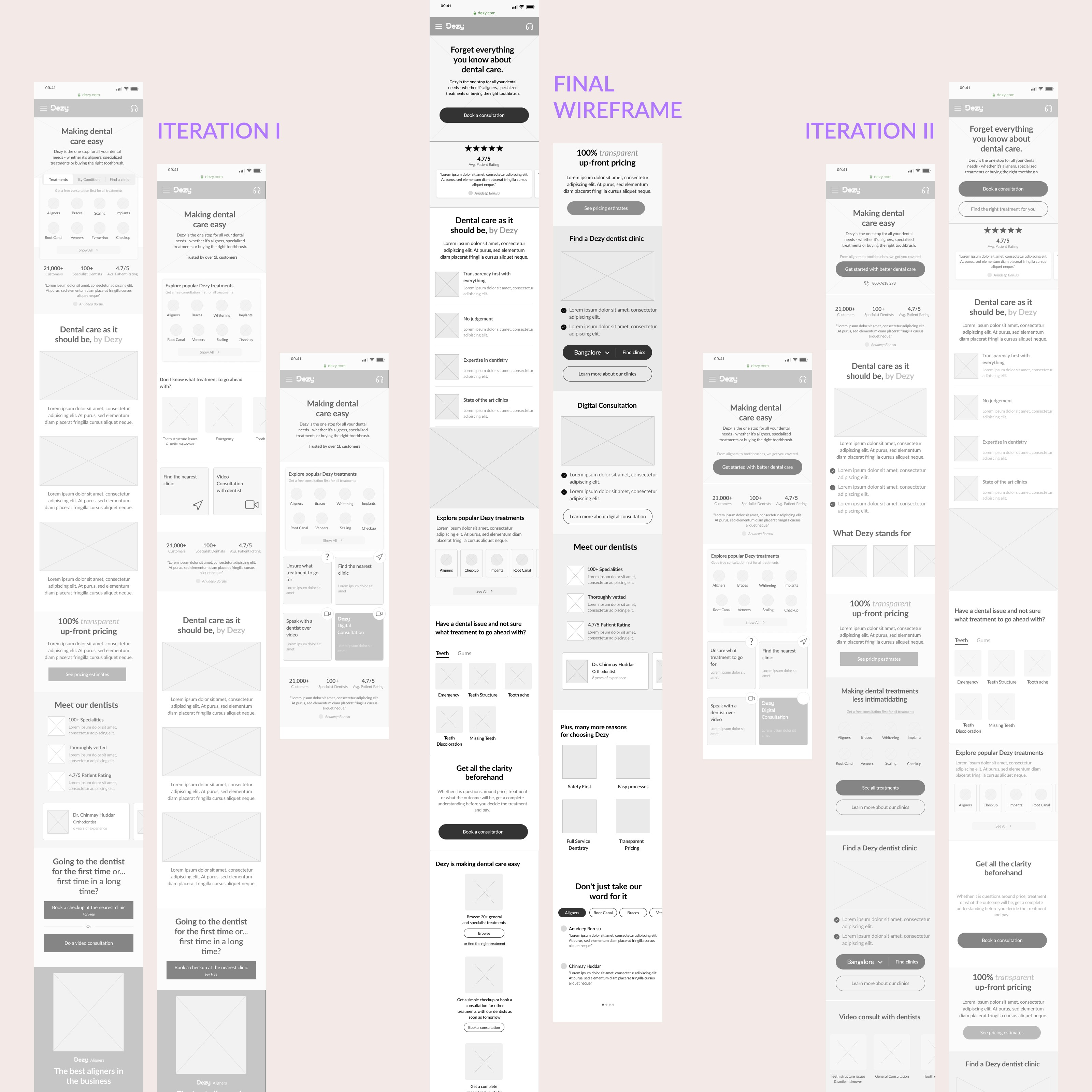
We started sketching low-fidelity screens. Once we had a visual direction of the layout, we started to add more details and precisions to the sketches by turning them into mid-fidelity wireframes. Creating mid-fidelity wireframes helped us focus on the visual consistency and hierarchy before applying styles.

In these wireframes, we tried to incorporate common design patterns that have been tested on our competitors' product, or included elements that directly address users' goals, needs, frustrations, and motivations.

View all Wireframe Iterations here

User Testing

Test Objectives

  1. Task Completion

  1. Task Completion

  1. Task Completion

Evaluate if users can successfully accomplish the tasks given to them.

  1. Time Efficiency

  1. Time Efficiency

  1. Time Efficiency

Measure the time it takes for users to complete each task to identify potential bottlenecks.

  1. Identify Pain Points

  1. Identify Pain Points

  1. Identify Pain Points

Pinpoint features or sections of the website that cause confusion or difficulty during navigation and task completion.

  1. Actionable Insights

  1. Actionable Insights

  1. Actionable Insights

Gather findings from the test results to inform and guide iterations for the next design round.

Patterns

Main CTA Engagement

Main CTA Engagement

Main CTA Engagement

4 out of 5 users clicked on the main call-to-action button to book an appointment, indicating its visibility and effectiveness.

Treatment Exploration

Treatment Exploration

Treatment Exploration

3 out of 5 users clicked on the “See All Treatments” option to book a digital consultation, suggesting interest in exploring available services.

Interest in Pricing

Interest in Pricing

Interest in Pricing

3 out of 5 users navigated to the “Why Dezy” section to learn more about pricing, highlighting the importance of transparent cost information.

The patterns suggest users have a clear intent when they land on the website – either to book an appointment, learn about treatments, or understand the cost. Ensuring a streamlined flow to these actions can enhance user experience.

Insights

  1. Main CTA Perception

Observation

Observation

Observation

Users assume that all Dezy services can be accessed through the main CTA flow.

Actionable Insight

Actionable Insight

Actionable Insight

Clarify within the main CTA flow that it includes a comprehensive overview of all services offered. Consider adding labels or subtext under the CTA to specify this.

  1. Dentist Section Placement

Observation

Observation

Observation

Users did not immediately notice the information about the dentists, suggesting that the section is currently too low on the page.

Actionable Insight

Actionable Insight

Actionable Insight

Move the “Meet Our Dentists” section higher up on the homepage to build trust early in the user journey. Placing it near the top can reassure users about the quality and expertise of the team.

  1. Consultation Cost Confusion

Observation

Observation

Observation

Users were unaware that consultations are free, which could discourage bookings.

Actionable Insight

Actionable Insight

Actionable Insight

Make the “Free Consultation” offering more prominent. Add clear messaging near the CTA or in a visible banner to emphasize that the consultation comes at no cost, encouraging more users to engage.

Recommendations

  1. Categorize all treatments (High priority)

Rationale

Rationale

Rationale

Grouping treatments into clear, logical categories will help users find what they’re looking for quickly, reducing decision fatigue and improving overall navigation.

Implementation

Implementation

Implementation

Create a visually distinct section on the homepage or within the main CTA flow that organizes all treatments into categories (e.g., preventive care, cosmetic treatments, orthodontics, etc.). Use icons or visuals to differentiate these categories for easy recognition.

  1. Add one-line reviews (High Priority)

Rationale

Rationale

Rationale

Displaying short, impactful customer reviews prominently will enhance credibility and trust, potentially increasing conversion rates.

Implementation

Implementation

Implementation

Integrate one-line reviews or testimonials near key CTAs or in the “Why Dezy” section. These can be placed in dynamic sliders or as static quotes to catch users’ attention without overwhelming the page with too much text.

  1. Incorporate videos (Medium Priority)

Rationale

Rationale

Rationale

Videos can effectively convey information, demonstrate procedures, and humanize the brand, making it more engaging for users.

Implementation

Implementation

Implementation

Add short, informative videos about common dental procedures, patient testimonials, or a welcome message from the dentists. Position these strategically throughout the website, such as on the homepage, in the “About Us” section, or within specific treatment pages.

Final Designs

After integrating insights gained from user testing, another feedback session was conducted with the team. The suggestions primarily centered around refining the information hierarchy. Recommendations included prioritizing sections emphasizing credibility and the 'How It Works' explanation over the treatments section.

📱 Once the final mobile design gained alignment and approval from the team, desktop pages were developed.

View Homepage figma prototype below

⏳ Please wait for it to load. Expand it for a better view.

⏳ Please wait for it to load. Expand it for a better view.

Results and Impacts

The updated homepage has seen a notable reduction in user drop-off, with the rate falling to approximately 14% in the first two months. Data indicates that users are exploring nearly all sections of the site and scrolling to the bottom of the homepage more frequently.

The updated homepage has seen a notable reduction in user drop-off, with the rate falling to approximately 14% in the first two months. Data indicates that users are exploring nearly all sections of the site and scrolling to the bottom of the homepage more frequently.

The updated homepage has seen a notable reduction in user drop-off, with the rate falling to approximately 14% in the first two months. Data indicates that users are exploring nearly all sections of the site and scrolling to the bottom of the homepage more frequently.

Additionally, there has been a substantial increase in lead generation, with higher-quality leads resulting from users making more informed choices, thereby boosting the conversion rate.

Dentists have observed that users who book clinic appointments through the website now have better pre-existing knowledge about their treatments compared to walk-in patients. This suggests that the enhanced visibility and clarity of treatment information on the website are effectively educating users before their appointments.

What I could have done more

Due to time constraints and limited resources provided by the company, I wasn't able to conduct extensive user testing across various platforms and multiple devices. This missed opportunity could have significantly enhanced the user experience flow. I would have conducted further A/B testing on CTA placements, adjusting the “See All Treatments” layout, and experimenting with different ways to present pricing information and testimonials. Collecting qualitative feedback (e.g., through follow-up interviews) to understand why users made specific choices.

Due to time constraints and limited resources provided by the company, I wasn't able to conduct extensive user testing across various platforms and multiple devices. This missed opportunity could have significantly enhanced the user experience flow. I would have conducted further A/B testing on CTA placements, adjusting the “See All Treatments” layout, and experimenting with different ways to present pricing information and testimonials. Collecting qualitative feedback (e.g., through follow-up interviews) to understand why users made specific choices.

Next Steps

This initial milestone marked just the beginning of a larger journey, encompassing the design of over 100 pages. These included individual treatment pages, booking flows, treatment subpages, 'My Appointment' and 'My Treatments' pages, review and referral pages, Dezy Clinics pages, and more.

This initial milestone marked just the beginning of a larger journey, encompassing the design of over 100 pages. These included individual treatment pages, booking flows, treatment subpages, 'My Appointment' and 'My Treatments' pages, review and referral pages, Dezy Clinics pages, and more.